Rachel Wilkins is an Associate in OJB’s Houston office.
What inspired you to become an architect?
I wanted a career that engaged both analytical and expressive ways of thinking. Foremost is design’s obligation to aesthetics and meaning, but if it doesn’t function it does not succeed as design. This requires a deep understand of the user experience, which means getting familiar with your clients and the various people engaging with the design, and how they are going to engage. For example, if you are designing a hospital you are taking a patient’s perspective, but also a doctor’s and a nurse’s. Because our clients and projects are so varied, everything has the potential to be a learning experience in this regard and I thought this was very exciting as a potential student. Also, almost every architect I knew as a kid loved their job.
How has an artist or an architect influenced your design and plant materials?
The big design theory buzzword when I was in graduate school was “phenomenology”. It is a design approach that focuses mainly on materiality, but also the aesthetics of geometry and how they can be composed in the world to convey meaning. I am a big fan of Steven Holl’s projects, like the Y House and the Bloch Addition to the Nelson-Atkins Museum of Art. I am also currently fascinated by the designs of Roberto Burle Marx and the latest paintings and sculptures of Frank Stella (who’s always a winner in my book).
What I like about Steven Holl is how he uses simple gestures and interesting materials to create really beautiful moments in design. The geometry of his Y House functions to bring light deep into the interior of the house, and also creates a unique interior that he sculpts to catch the light in various ways. It’s a very simple move that is both effective and meaningful. I also like how he uses complex metaphors, like musical forms, as inspiration.
I was introduced to the Brazilian landscape architect and painter Burle Marx while working on a recent project which used his wavy forms as design inspiration. Marx is just out of this world! His work is dynamic and engaging but also meticulously composed and balanced. So much design is somber, orthogonal, and relies on alignment and austerity to distinguish itself from the pedestrian. Marx’s graphic approach is fun and bright, and compliments the extroverted and easy-going Brazilian identity so well. I grew up in Rio de Janeiro, and realizing that I recognized those patterns from my childhood days of roller skating on the beach was quite an epiphany.
I like Frank Stella because he is such a seasoned artist, and you can see how his process has developed over the years. Last year I met my sisters in Dallas to spend the weekend reviewing the retrospective exhibit cultivated by the Whitney and Fort Worth Museum of Art. In the collection were the paintings that put him on the map, like the Protractor series and Black and White series, which are very geometric and satisfying to my inner architect’s compulsive devotion to order. As the retrospective progresses throughout the years, you can see him becoming self-critical of his own process without rejecting it outright. Every piece becomes a part of an inner, personal dialogue with himself where he is aware of how he is thinking and creating. I think starting simply in his earlier work endowed his later work with compositional instinct that had even more time to mature throughout the 1980’s and through to today. Not a lot of artists are prolific and long lived enough to enjoy this.
What is your focus when designing? What makes your work rewarding?
I am constantly re-evaluating how a design feels in terms of experience, proportion and materiality. I focus on what the user wants to feel, and how I can coax the most beauty and meaning out of the existing parameters of the site. One of my favorite studio professors in school also coached me to focus not only on the geometry and composition of the physical design, but also how use and social interaction form their own geometries and systems that can reinforce (or diminish) that overall composition.
The most rewarding part about my work is watching people enjoy the spaces I helped to create.
Where do you go to feel inspired?
The art book section in the Museum of Fine Arts Giftshop. Seriously the best curated collection in Houston. Brazos Bend Bookstore is a close second. Give me a cup of coffee and I’m set for a few hours.
What has been your favorite OJB project to work on and why?
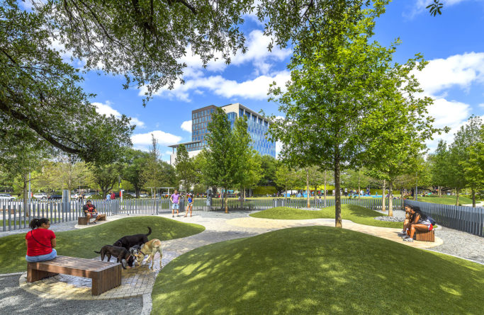
Bringing the Levy Park project to life was humbling and life changing. I worked with a team of five other people to coordinate late stage design development, construction documents and a little bit of construction administration. My favorite part was seeing the complex, ringed monumental entry to the Children’s Garden erected and installed after much back and forth with the steel manufacturer. Also, the paver layouts in the dog park create very manicured, human-scaled spaces that are a delight.
